There are many different forms of colour blindness and in many situations it is impossible to make your plots completely suitable for everyone. However, there are many simple things that can be done to drastically increase the accessibility of your plots for people who suffer from colour blindness. Increasing the accessibility of your work makes life easier for everyone, making your plots more readable even to people who do not suffer from colour blindness.
Here is an example of a basic plot with HGUTheme
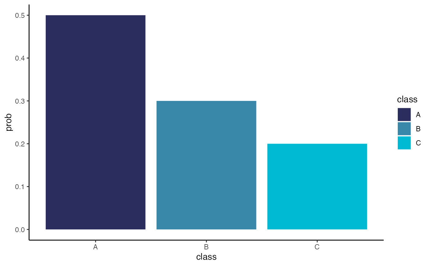
Here is what this plot would look like to people who suffer from various forms of colour blindness.
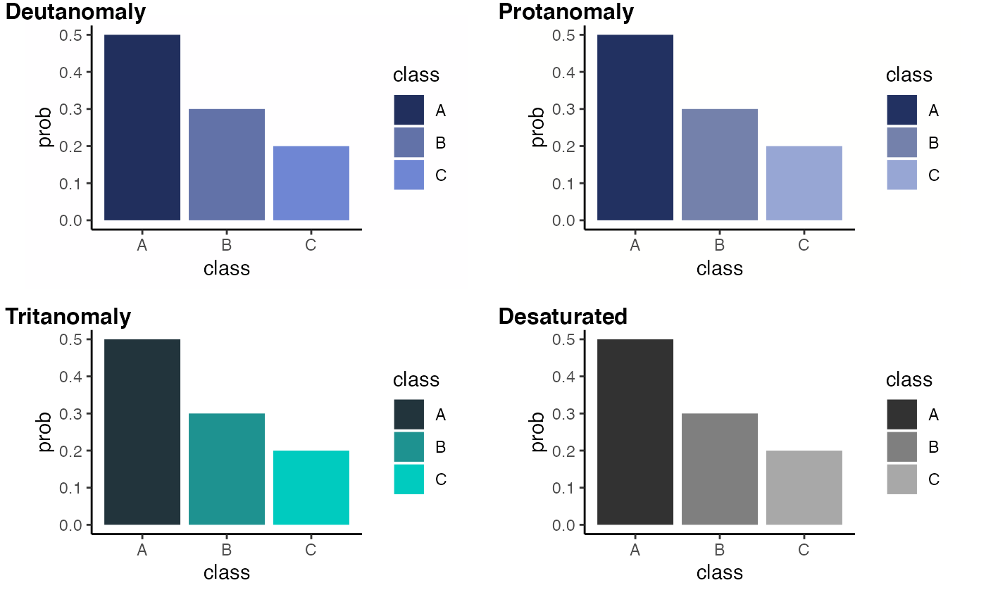
This might not look too bad, but lets compare it to another plot with a palette designed for people who suffer from colour blindness.
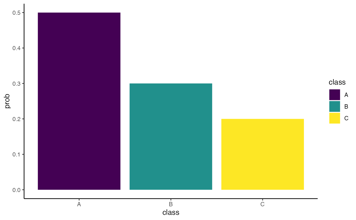
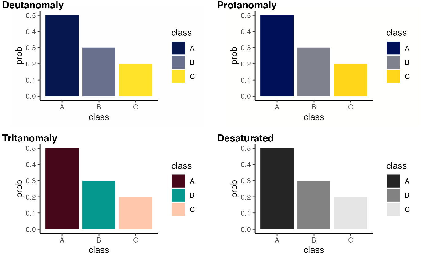
This might not fit in aesthetically the same way with the colour theme associated with your unit, but it is obviously much better for people who suffer from colour blindness.
If you wish to recreate these colourblind representations
yourself, they were made using the colorblindr package,
found here.
To find out more about colour blindness then here are some resources that we and our colleagues find useful:
